In October, I moved to prose.sh from pika. As I wrote about it before, this means moving from a more elaborate platform to a basic markdown renderer.
Prose has a very minimalistic style, and there's nothing wrong with that. But I wanted to have something a bit more "unique", so I thought about customizing the CSS a bit. Bits of that slipped in with yesterday's post, so I decided to fix it up to an acceptable level and write a bit about this here.
Where we started #
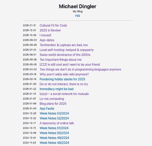
Without any custom style, my blog would look like this:

It's a running list of posts, with prominent dates, but no separation between months or even years. Also, every Prose blog looks like this…
Divide et impera #
I don't like that I now have posts from three years, but they're all one list. If I were doing my own blog system, I would solve this in the processing stage: While going over all the blogs, I'd check if there's a new year and then add a HTML segment.
But when all you've got is CSS, that's what you use to hammer in annual headings.
Slightly simplified, the links on the main page look like this.
1<article>
2	<time datetime="2025-12-31T00:00:00Z" class="text-sm post-date">2025-12-31</time>
3        <a href="https://michaeldingler.de/2025-in-review">2025 in Review</a>
4</article>
And so I added the following CSS content in my custom stylesheet:
1article:has(time[datetime^="2026"])::before {
2    content: "2026";
3    display: block;
4    font-weight: 600;
5    letter-spacing: 0.05em;
6    margin: 1em 0em 0.75em 0em;
7}
This puts a block of content saying just 2026 before every article element that has a time element with a datetime value that starts with 2026.
Bold, slightly letter-spaced, and with more margin on the top than bottom, as usual for headlines.
But this puts it in front of every article from 2026, and I only want it in front of the first one. But modern CSS selectors come to the rescue again:
1article:has(time[datetime^="2026"]) ~ article:has(time[datetime^="2026"])::before {
2    content: none;
3}
This tells the browser to not have content before every article with a 2026 timestamp followed by an article with a 2026 timestamp.
I have to copy and peste these styles for every year, but that's acceptable. I have to do it once a year, and it's not unduly bloating my stylesheet. Probably compresses down to next to nothing.
Less prominent dates #
The dates in front of every article are a bit too present. I thought about moving them after the text, but decided to just de-emphasize them a bit.
In the standard stylesheet, they're rendered slightly smaller, which I don't think is enough to create some hierarchy of importance between them and the post titles.
So let's make them blend more in the background. And here's where I got hit by one of the "wonders" of the modern WWW age: Dark mode.
Not only do you have to concern yourselves with people browsing on teeny-tiny mobile devices, no, someone decided to extend the skeuomorphic white-on-black rendering of Unix or DOS terminals to the whole user interface. (And in turn made the old default "light mode" worse, for some kind of reason)
Hmm, I should expand this in a longe rant later…
Anyways, the Prose default system is already using some CSS variables for text and background, and these days you can modify colors directly without a preprocessor.
Thus it boiled down to this simple rule:
1.post-date {
2    color: color-mix(in srgb, var(--text-color), var(--bg-color) 40%);
3}
In light mode, this mixes the text color with something closer to white, and with black in dark mode, without me having to specify separate rules for each.
Background noise #
I wasn't so lucky with the background, though.
To be a bit more playful, I visited the great Heropatterns, which allows you to create some inline SVG content that can be used for backgrounds easily. I went a bit bolder for now, mostly because I got a bit tired of too many gray-ish minimalistic sites.
I might be able to shoe-horn some variables into that later, but now I've hard-coded values for both light and dark mode:
 1@media (prefers-color-scheme: light) {
 2    html {
 3        background-color: var(--link-color);
 4        background-image: url("data:image/svg+xml,%3Csvg width='6' height='6'
 5        viewBox='0 0 6 6'
 6        xmlns='http://www.w3.org/2000/svg'%3E%3Cg
 7        fill='%23dddfd5' fill-opacity='0.4'
 8        fill-rule='evenodd'%3E%3Cpath d='M5 0h1L0 6V5zM6 5v1H5z'/%3E%3C/g%3E%3C/svg%3E");
 9    }
10}
…and something with just different colors for the dark mode.
I'm okay with the result for now, but it's high on my list of future changes.
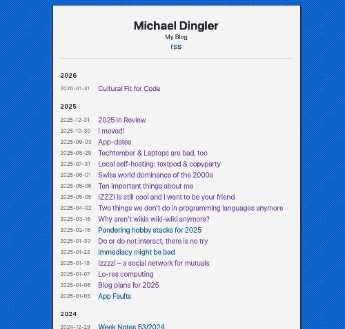
The final result after all these changes looked like this in January 2026:

Forever Under Construction? #
As I wrote above, some things would've been easier done with my own blog system. So I made myself the promise to not look to deeply into this until my yearly subscription for this host ends, and will only concern myself with features that can be done with the tools Prose offers right now. (Although a tool that just mirrors things on Gemini or Gopher is possible)
- Look whether I just want a duotone background or even just a separate wide header on top.
- See if I can get some "Uses This" / "Now" / "About" pages
- Style up the text content a bit more, without going for site-specific fonts.
- See if I can have some better display of blog images
MySpace offered its users to customize their profile pages with CSS. So does its homebrew "successor" SpaceHey, and it's quite amazing what some people manage to do there.
If it works for them, it should work for me, at least until September…