It’s hard to believe these days, but there was a world before flat design.
If I’m looking at my screen right now, there’s little shading besides the windows borders, whether I’m looking at native applications or what happens in my browser tabs–not that there’s a lot of difference when a lot of native apps consist of “web views” to a great degree.
Material Design for Android and web apps and whatever Apple calls their current style are dominating the landscape, there’s a bit of variation in rounded corners and how low-contrast the color combinations are, but that’s basically it, there’s only so much you can do here.
But at the beginning of the current millennium, this looked a bit different. This was the first era where you could rely on desktop computers having thousands, if not millions of colors available, with relatively high resolutions, with low-noise flat-screens or high-end CRTs being the rule.
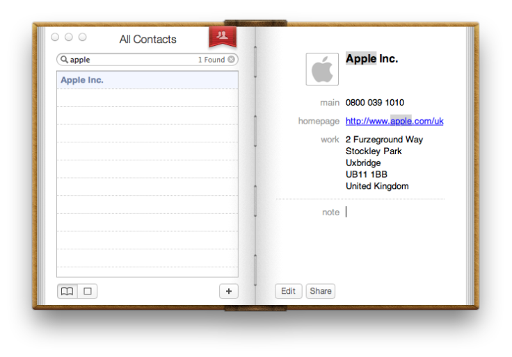
This made it possible to go beyond the relatively simple ’90s 3D look of buttons (think Windows 95 or Nextstep) to glossy gems and fluid corners. Then there was the trend of “skeuomorphism”, where things on your screen looked like real-world materials or even items.
Can’t please people #
But just like today people1 rally against the lack of visual distinction between user interface elements2, people back than were yearning for a stylistic renewal.
They wanted to use the new-fangled capabilities of high-res displays (1900×1200!) in a different manner, not going for a skeuomorphic approximation of reality, or 3D to suggest with what user interface elements you can interact, but going for what they considered the pinnacle of print design: The “International Typographic Style”, aka. “Swiss Design”. I don’t want to go to deep into that, but common elements were:
-
Grids everywhere!
-
Simple color schemes. Given that this is “Swiss Design”, the main color of its flag, i.e. red was common.3
-
Sans-serif fonts… ah, who are we kidding: Helvetica
Helvetica, mon amour #
There was huge hype about this particular font back then. They even made a movie about it–a font!–in 2007. It stood in for the whole design genre–and had the advantage that you could actually repeat this online without much issues. This trend started right before webfonts were available, but Helvetica was part of every desktop computer’s font stack since decades4.
This included a lot of retro-fitting this modern design into web apps via browser extensions or official themes. Google Apps were a common target, both because of their ubiquity and Google’s general disregard of design.
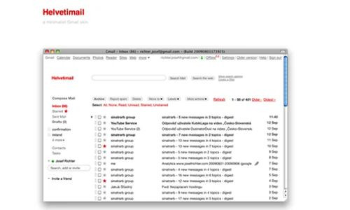
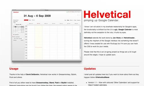
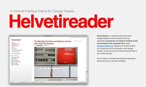
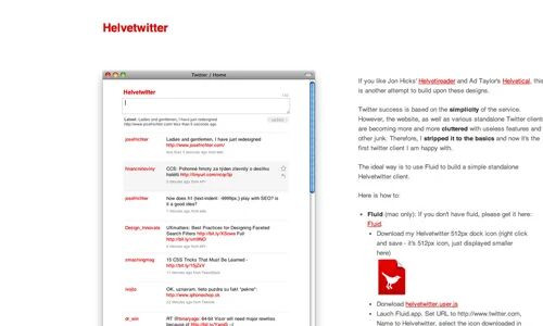
They were bright, bold, and had plenty of whitespace. Monitors were getting bigger, with Apple having a 30" display early, and 4K monitors becoming available at the end of the Helvetica era.
Design “sensibility” amongst Apple fans was arguably a bit higher, which is why this was very popular there. It didn’t hit the native applications as much, as sticking to the interface design guidelines is also a big Apple thing. But whenever you had some custom rendering or went straight for a web app, you couldn’t go wrong with design that was heavily into grids, used red as an accent color and put Helvetica at least amongst its possible fonts.
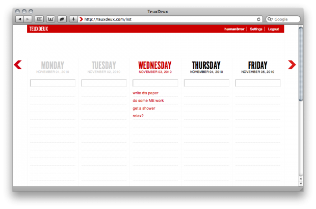
The webapp TeuxDeux can be counted amongst the reasons why I’m posting this, as I’ve recently gone back to using it, and it still sticks quite close to its Swiss Design origins5.
Victim of its own success #
But TeuxDeux sticks out here, there’s not a lot out there with that color scheme or font choice. Part of that is just fashion. We’re not talking about good interface design here, this wasn’t a result of usability studies, it was web designers hyping an already overhyped typeface.
Which made the late pinnacle of this all the more surprising: Apple going all-in.
iOs 7 in 2013, and OS X / MacOS 10.10 in 2014 featured Helvetica as their system fonts. Other design elements also replaced the previous fake-realism.
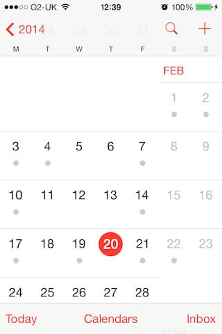
This didn’t go down well, especially on the desktop side. There were multiple attempts to get this back to moderately sane levels by bluntly overriding system files.
It definitely brought the deficiencies of Helvetica itself into the limelight, but the new flat look remained beyond the two iOs and MacOS versions, even to this day.
Also in 2013, Google introduced its Material Design look and feel. Primarily aimed at their own webapps and Android, it soon grew bigger than that. The complex web frameworks we’re using now coincided with this flat look and feel (Angular in 2010, React in 2013) and made “component libraries” for applications much more popular. And if your standard tool kit uses this look and feel, you’re more likely to encounter it in every place where there’s not enough effort spent in producing something different.
And now that web applications have spread to the desktop, flat design is the new normal, with even “native” applications adapting.
Don’t blame it all on the Swiss.